THE IDEA
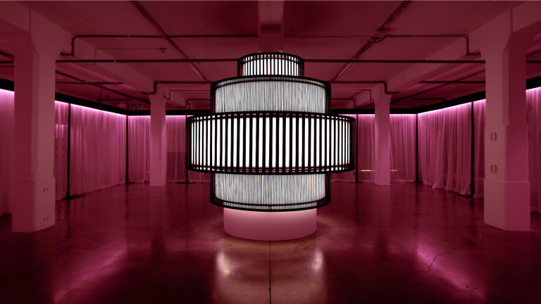
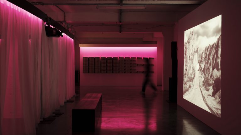
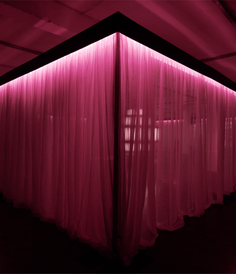
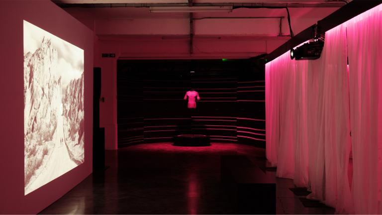
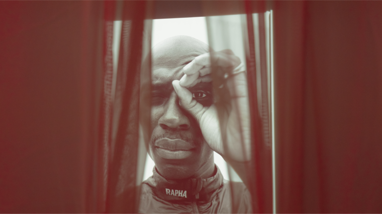
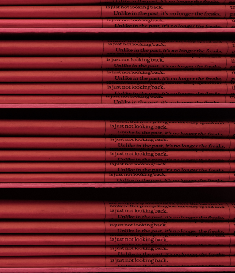
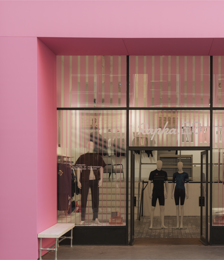
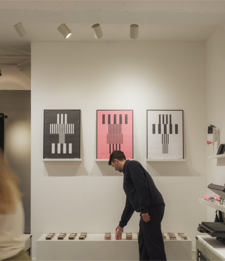
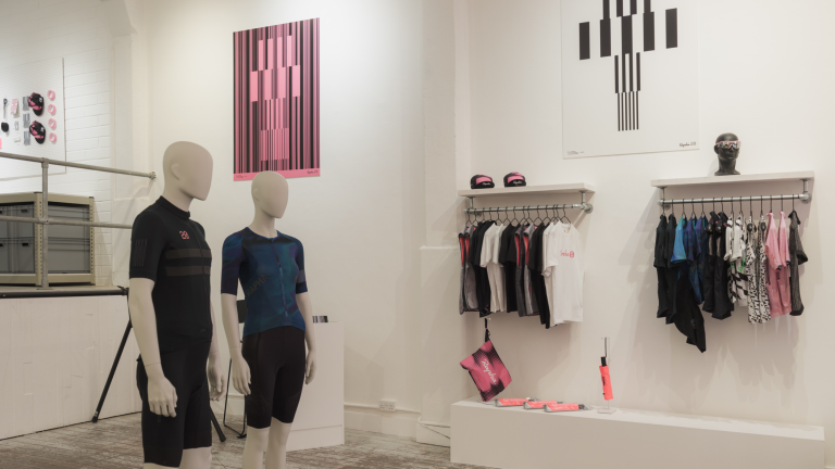
For the imagery, product, and spatial design, we looked to the archives and were inspired by the subtle yet ever-present shade of Rapha pink. Speaking volumes without saying a word, we amplified this colour throughout, pulling it across the exhibition space, store windows and collectable collateral including a limited run of posters, jersey patches and bike stickers.
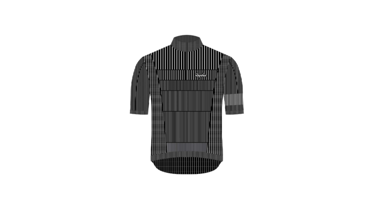
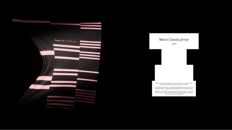
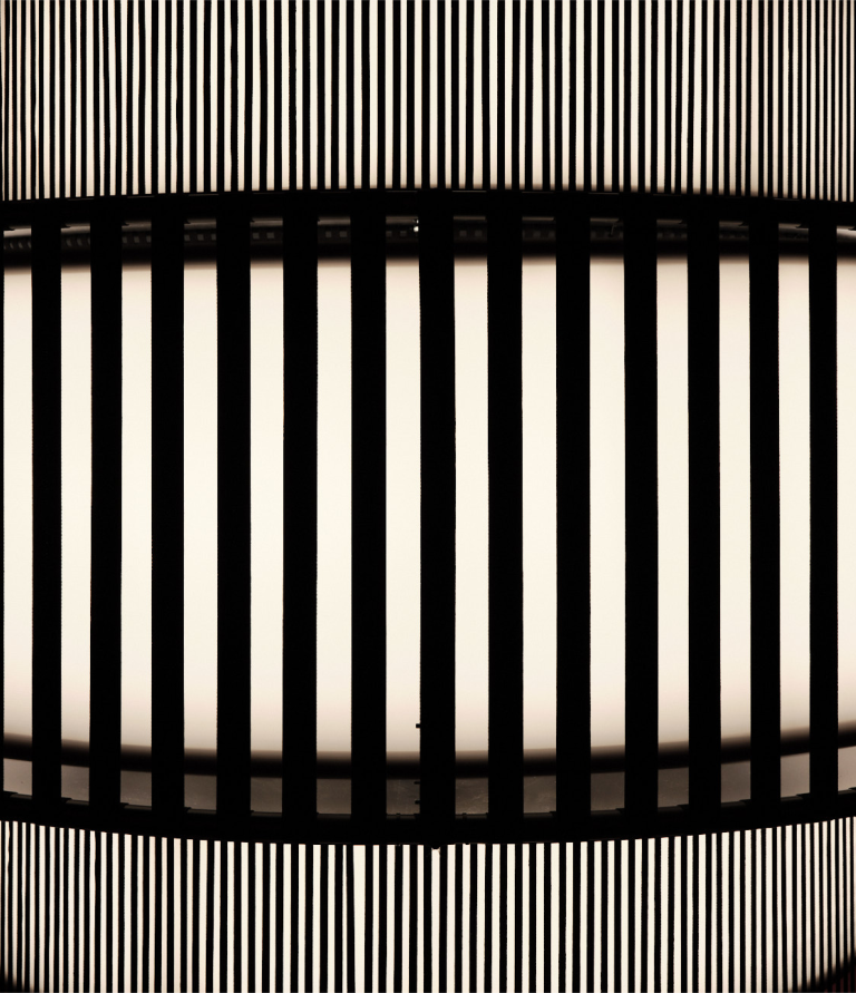
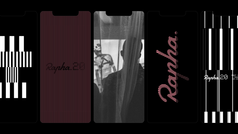
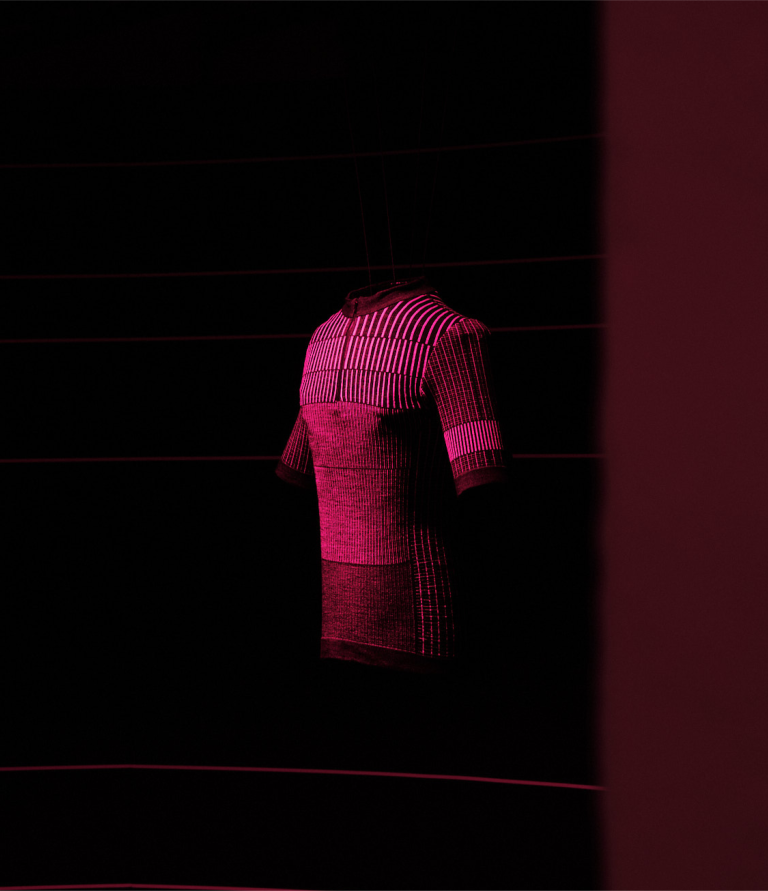
We then took inspiration from the unique pattern of the Rapha20 jersey to form a dynamic, flexible and ownable design system for use both within the physical space and the brand’s digital world. By manipulating and removing individual threads of the pattern we conveyed a sense of momentum and movement, of Rapha’s relentless pursuit of always moving forward, across web and social assets.
Capturing the whirring atmosphere of the ride, we harmonised distinct rhythms and tempo to create an exhibition space that embraces the wind, breathe and, naturally, the finish line. Designing an immersive space we considered the light, the materials and sound to complement and heighten the impact of Isabel + Helen’s installation which used the same visual language.
